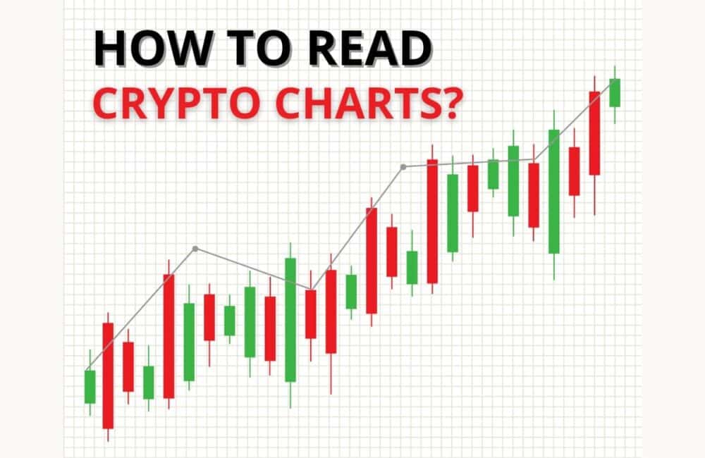
Trading various cryptocurrencies have been in trend ever since the pandemic started as people want to make a quick buck. However, the price volatility and risk factor involved can cause you to lose your money. As a result, many people have started learning about analyzing different price charts to understand the movements in crypto prices. But if you are a beginner who has no idea about what a crypto chart is, then we will be explaining in detail different crypto charts and various ways how you can read crypto charts.
What Are Crypto Price Charts?
As a beginner who has never traded or invested in the stock market before cryptocurrency trading, you may slightly lack an idea of what the price charts consist of in the investing world. Crypto Price Charts are very similar to the charts that are available for various stock and futures trading. Analyzing and trading price charts is known as Technical Analysis. There are four basic types of price charts seen in technical analysis:
How To Read Differnt Types Of Crypto Charts
1. Line Chart
This is the most basic type of crypto chart that you can use for price analysis. It is also the simplest to read. The price of the chart is represented by a line and the height of the line varies according to the price at a specific time point.
The line chart may have either Linear Scales or Logarithmic Scales. In the linear scale chart, the price axis is divided into equal sizes. On the other hand, in the logarithmic scale chart, the price is scaled up or down depending on the percentage change.
For example, if two changes in price are equal in percentage change although they may be different in absolute values, the graph represents both the changes with the same vertical shift.
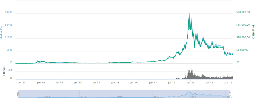
Line Chart – Source: tradesanta.com
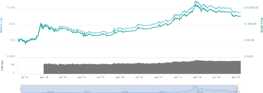
Logarithmic Chart – Source: tradesanta.com
Usually, the bottom of the chart provides the volume indicator which talks about the total amount of cryptocurrency coins traded for that period. Volume is a good parameter to predict the direction in which the crypto price asset might move towards next. For instance, if the crypto asset’s price increases with the maximum volume, it means the traders are being active to transact in that crypto asset. In this case, the price of the crypto asset may increase. On the other hand, if the volume traded is less and the price reduces, not many people are selling or buying cryptocurrency.
Linear charts are better to see the price fluctuation of the asset throughout a specific period. Log charts give an idea of the trend of price variation of the asset over a time period.
Recommended: The Future of Cryptocurrency Explained
2. Bar Chart
Bar crypto charts are a more common form of charts used for analyzing prices against the line chart. Bar charts are made up of small bars that represent the price action on the chart. Instead of plotting only the closing prices, the bar chart highlights four different price actions: open, high, low, and close. Other than this the bar chart may be represented by a black and white structure or a colour structure consisting of red or green bars.
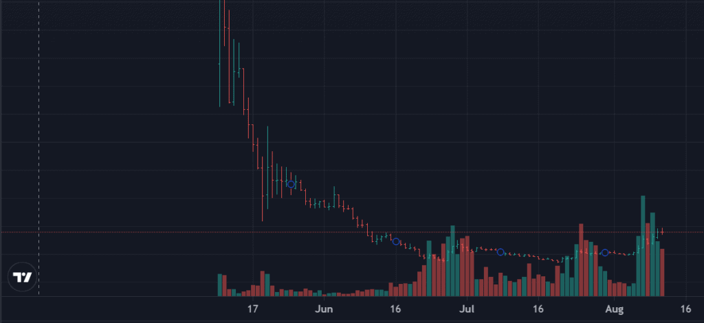
Source: tradingview.com
3. Candlestick Chart
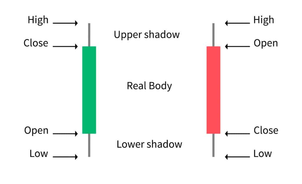
Candlestick crypto charts are used more widely than any other form of the chart because of their reliability. A candle is very similar to a bar formation except its body is structured in the form of a block surrounded by two wicks on the top and the bottom. Just like the bar chart, the candle chart also has four different price actions.
- Green candle appears on the chart when the closing price is higher than the opening price
- Red candle when the closing price is lower than the opening price.
Source: coindesk.com
The candlestick has a few parts which are to be understood to know the values they represent:
- Open: The Open is the price of the asset it is representing at the time of the commencement of the trading period
- Close: The Close is the price of the asset it is representing at the time of the conclusion of the trading period
- High: The High is the highest price of the asset during the trading period
- Low: The Low is the lowest price of the asset during the trading period
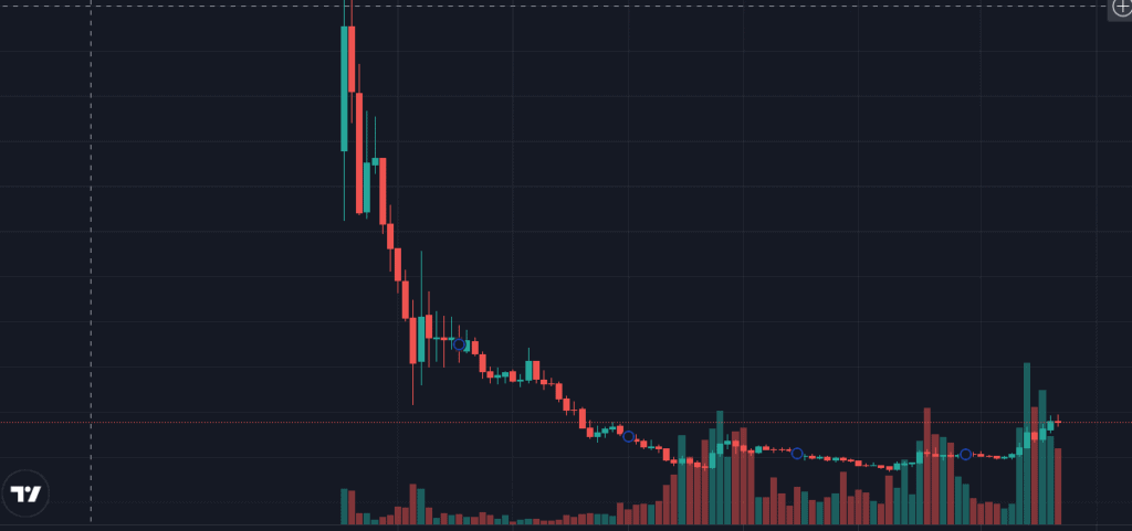
Source: tradingview.com
Depending on the increase or decrease in the price of the asset in the trading period, a green or red candlestick is used respectively. The ‘Close’ lies at the bottom in a red candlestick and the ‘Open’ lies at the top because the overall price of the asset has reduced.
Since candlestick is popular in use when it comes to technical analysis it is important to learn different patterns which may help you understand the price action of crypto. There are two kinds of candlestick patterns in crypto charts:
3.1 Bullish Candlestick Patterns:
Bullish candles highlight the optimism of the investors by forming a large body in an upward trend. The larger the body of the candle, the higher the possibility of an upside in the stock. For eg. Hammer, Morning Star, etc.
3.2 Bearish Candlestick Patterns:
Bearish candles highlight the pessimism of the investors by forming a large body in a downward trend. The larger the body of the candle, the higher the possibility of a downside in the stock. For eg. Hanging Man, Evening Star, etc.
There are also various forms of reversal candles and patterns that can be used on an advanced level to identify different price actions on the crypto charts.
The typical duration of a candlestick may be for 1, 2, 4 or 12 hours.
Recommended: How to Make Money with Bitcoin?
4. Heikin Ashi
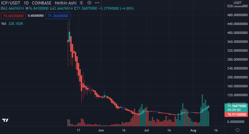
Heikin Ashi has chart candles similar to the candlestick chart however it uses average price movement to create its candlesticks. It has a greater reliability factor than the candlestick chart and has a smooth formation indicating an uptrend or downtrend that can be easily identified.
Source: tradingview.com
Main Points To Remember When You Read The Crypto Charts
Crypto Price Charts can be read using the three basic methods that can help you as a beginner to understand the price action and analyze the movements. The following are the 3 steps to read the crypto price chart:
1. Selecting A Time Frame
Most crypto traders use candlestick charts to analyze the price action hence it is a brainer that the majority of the time even you will prefer the candlestick charts. But beyond the crypto charts lie different time frames that will help understand the price action taking place in a short period or long term. Selecting a time frame depends upon your trade strategy that will differ for different people. Following are the different categories of traders that use different time frames:
- Intraday Trader: As an intraday trader, you must always prefer a lower time frame that will help you understand the price action taking place during the day. Usually, intraday traders prefer a 5-min to 15-min time frame to understand the price action so that they can execute their trades.
- Short-term Trader: If you are a short-term trader who wants to create a position today and sell it beyond a week then you can look at the daily chart or a weekly chart to understand the entire week’s price action.
- Long-term Investor: If you are an investor who is keen on buying and holding for the long term, then you can look at the weekly chart or the monthly chart that will give you a better picture of the longer-term price movements.
However, as a long-term investor, it is better to look at a higher time frame to get clarity on the crypto price action.
2. Price & Volume
Every price chart has different technical indicators that can be used to confirm the price action. Volume is a prevalent indicator in technical analysis that is used to understand the most basic form of price action. The volume will highlight the amount of price action taking place on the chart in a particular time frame. Two types of volume bars are seen on the crypto charts:
- Green Bar: A volume bar representing green color indicates that there is a great demand for the crypto token in the market with a lower supply.
- Red Bar: A volume bar representing red color indicates that there is a great supply for the crypto token in the market lower demand.
In addition to this, if a volume bar is larger then it indicates greater demand or lower supply depending on the price action. The volume will fluctuate more when the price is highly volatile.
Recommended: Free Bitcoin Mining Sites
Final Note – How To Read Crypto Charts
As a beginner, it may seem overwhelming to understand different charts and the pattern formations that can be used for price action analysis. However, if you are planning to trade crypto tokens then understanding the crypto charts and learning how to read them will help you immensely in your trading journey. The information stated above is the most basic way to start your cryptocurrency trading journey using price action analysis. With the help of learning and practice, understanding crypto charts will be very feasible and helpful in your long-term success.
FAQ’s – Crypto Charts
Is Heikin Ashi Reliable Over Candlestick Charts?
Heikin Ashi, although underrated, is a reliable form of chart used by few traders to understand the price action.
Are There Any Books On Technical Analysis?
There are many books on technical analysis. The most prominent one is ‘Technical Analysis of Financial Markets’ by John J. Murphy who was the father of technical analysis.
Which Platform Is The Best For Crypto Charts?
The most popular platforms used by modern traders are “TradingView” and “Coinigy”.
Why Does A Crypto Price Keep Rising?
If a particular crypto token has greater demand in the market then its price will inflate and it will keep rising.
Which Are The Best Chart Indicators That One Can Use?
You can use chart indicators such as Chaikin Money Flow, Moving Average Convergence Divergence (MACD), Relative Strength Index (RSI), Ichimoku cloud, and Fibonacci Retracement to analyze the price action alongside candlestick patterns.

